


Bena Sareen is a well-known book designer working with the publishing industry for over two and a half decades. A designer and art director of over a thousand book covers, she received several awards, including The Oxford Book Cover Prize 2015, The Publishing Next Book Cover Prize 2017, The Oxford Book Cover Jury Appreciation 2024, Oxford Bookstore Art Book Prize runner-up 2025 and more recently the 11th Oxford Book Cover Prize.
Sareen set up the design department at Penguin India in 1999, and later at Aleph Book Company Delhi in 2011. Publisher for the art books imprint, Penguin Studio, as well as the backlist publisher at Penguin India, at present, she runs an independent design studio in Delhi. She was awarded the 11th Oxford Book Cover Prize for her outstanding cover for Amitava Kumar’s My Beloved Life, published by Aleph Book Company.
In a recent conversation at the award ceremony for the Oxford Book Cover Prize, Sareen talked about the inspiration behind the winning cover, challenges faced during the ideation and design process, the design elements she incorporated, and her 26 years in the book design space.
My Beloved Life captures the extraordinary life of an ordinary man (Jadunath Kunwar) from post-Independence to the modern day. On how she translated this blend of the “mundane” and the “epic” into the visual language of the cover, Sareen said a book cover, especially fiction, is open to multiple interpretations.
“Just as a reader’s experience can be quite subjective, so is the designer’s engagement with the manuscript. As I read the novel, I developed a special affinity for Jadunath, one of the two protagonists. The period—early 1940s onward—brought on a certain nostalgia for a time gone by. I picked on the postcard as a metaphor for a way of life–for memory, for migration; themes that reflect in the novel across the lives of the two protagonists.”
The juxtapositioning of the postcard with a modern rendering of the protagonist with bursts of color is meant to convey a certain sweep of the novel, she said. “From the mundane to the promise of something more; from local to urban. And in doing so, I hope to reach out to a wider audience, across generations.”
According to Sareen, Kumar’s writing has a strong local flavor, and yet is global. “The Indian Postal Service yellow postcard firmly establishes the local. Many of us will identify with it with a sense of nostalgia. I went on to add some authenticity and placed the postal seal bearing the name of the city, Patna, where much of the novel is set.”
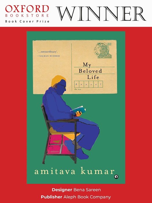
The lettering is deliberately informal, not perfectly aligned to exaggerate the small-town feel, Sareen said, adding the spine zooms in on the serrated paper texture—the imperfect tear. These small details come together to create the right tone. I went on to contrast this with a bright color palette and a modern illustration style for the protagonist in the foreground, she added.
The good old yellow postcard became my hero for the cover treatment, Sareen said, adding she loved its simple graphic form and colors. “It provided a natural perch for the title, and I was overjoyed that the subtitle, ‘A Novel’ fit perfectly into the six-digit pin code holder. This, along with the seal bearing the name, Patna, are the small details that add value and authenticity. I hope the discerning reader will derive the same joy as I did in the process of tucking in these details. I contrast this nostalgia with a modern rendering of the protagonist with pops of color, and in doing so, I hope to reach out to a wider audience, across generations.”
Sareen told Indian Printer & Publisher that she had worked on several of Kumar’s books over the years. “I am grateful for the trust he has always reposed in me. When you have that, you can explore freely, resulting in some of the most satisfying cover solutions,” she said.
Evolution of Indian cover designs
When she initially started design work at Penguin India, she didn’t have much access to the internet. “I often wonder how I arrived at cover solutions.”
“The design landscape has transformed dramatically over the years. With access to photographers, illustrators, and designers from around the world—from Bundi to Bogotá—through social media and the many platforms that showcase creative work, we have been able to forge diverse artistic collaborations and produce some truly outstanding book covers,” Sareen said on the evolution of Indian cover designs over the years.
With years of experience, she has not only been able to hone her skills but also gained a deeper understanding of genres and target audiences, along with the ability to understand the author’s voice better, and meet the expectations of publishers, she said.
“David Davidar, who hired me at Penguin India, and later, at Aleph, always encouraged free thinking. Today, I would like to believe my design language is eclectic. I have become more experimental, pushed myself towards cover solutions, which were not necessarily my first instinct, and failed many times. And sometimes, it led to the most exciting outcome,” she explained.
“Cover design has come a long way from when I started. It gladdens my heart immensely to see where Indian book design stands today. There is a variety of visual language the very talented book design community displays, producing some marvelous work. There is also a greater recognition and appreciation from the reader community,” she concluded.


