


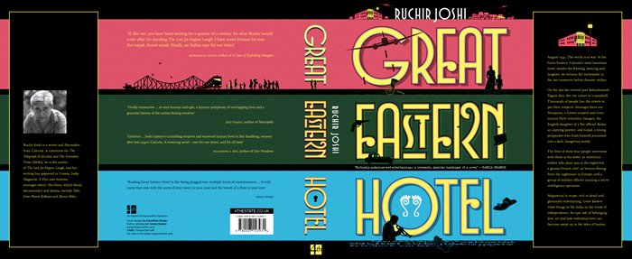
At over 900 pages, Great Eastern Hotel by Ruchir Joshi is a long book. It isn’t a single story, it’s the stories of the five main characters – Kedar Nath Lahiri, an upper caste intellectual artist; Nirupama Majumdar, a communist volunteer; Imogen, an Englishwoman whose father is an official with the British Raj; Gopal, a pickpocket who gets involved in black marketing; and the city of Calcutta itself. This multiplicity of narratives relates directly to how the cover visually represents many intersecting lives and the city as a character.
“The book doesn’t have that structure that something happens in the beginning and something happens in the end, as there are many separate beginnings and many separate ends. The point about juxtaposing these stories is that the Great Eastern Hotel is more like a landscape that is not dominated by a single feature,” says Itu Chaudhuri, who, together with Ashok Dey, designed the book cover.

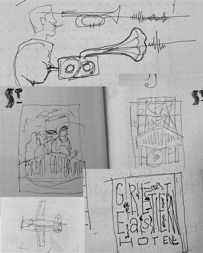
“For the design, therefore, we pretend or imagine that the title, Great Eastern Hotel, is a canvas through which the author Ruchir Joshi is telling the tale of the city. If you take away that canvas, the cover wouldn’t be interesting or make much sense. In the same vein, you can imagine these letters as the facade of the Great Eastern Hotel, and in an early attempt, we actually tried to picture the facade architecture – to make the Great Eastern Hotel the screen and to project the story onto it, Chaudhuri says.
Eventually this concept has been visualized through lettering. It expresses something about Calcutta and its culture in the 1940s, and for a certain class it is full of European influences, articulated in a very Bengali way. It’s a particular species of European, the colonial European, whose life has absorbed something from each colonized land; and then fed back into a European core, Chaudhuri says.
“Since we are making the lettering the main thing, it has to get it right. It must feel like the city and period, without a single image to hang on to, as is the common cover design pattern. In principle, you could say the letters are the map of the city, or you could say that these letters picture, and not just spell, the Great Eastern Hotel.”
Chaudhuri emphasizes that the Great Eastern Hotel is not about a singular event but presents Calcutta as a landscape via intertwined stories. This approach informed the cover’s design, using lettering to evoke a landscape and include narrative elements.
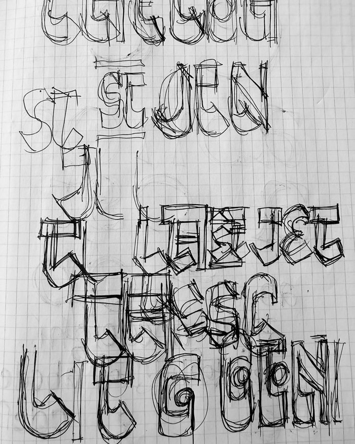
Chaudhuri designed the letterforms for the cover – the start of a typeface mischievously named Bong Deco. It evokes the Bangla script and the Art Deco lettering style which suits the period and milieu of the novel. “Though the skeleton of the letters has an Art Deco structure, their flesh is Bangla. The pen angles used in Bangla create a particular placement of thick and thin strokes, which is exaggerated and used in the cover – this is not typical in Art Deco lettering. In addition, a few Bangla script elements are spliced into the letters.”
The combination of ‘S’ and ‘T’ into a single letter in ‘Eastern’ is a typical art deco ligature, (a shape that combines two or more letters into a single glyph to solve an aesthetic or practical problem). Though Art Deco was a form of commercial lettering, its features have been exploited architecturally, he adds. You can see two flights of steps. With the windows, the steps convey the sense of a building, establish a period, and give a narrative tension, he says.
The objects on the cover play with the building and are drawn from events in the book.
In some ways, the Great Eastern Hotel is a history of Calcutta of the 1940s, when the city is transitioning in many ways – huge numbers of people are migrating into Calcutta, capital (money) is leaving Calcutta as Bombay is rising. Still a great colonial city, it is as much a European city in some sense and a very Bengali city at the same time; the Second World War is going on, which starts a couple of years before the period covered in the book, the British and other foreigners who are already in Calcutta find themselves very well placed to be a part of that war, Chaudhuri says.
“Calcutta presented a mixed milieu, with European influences overlaid on an Indian city, making it, at the time, perhaps India’s most international city. Calcutta had an independent presence and significance. To convey this, we filled the cover with a canvas created from lettering and enhanced it with elements from the book—a strategy that remained constant,” he adds. Even after independence, Calcutta remained a window to the world.
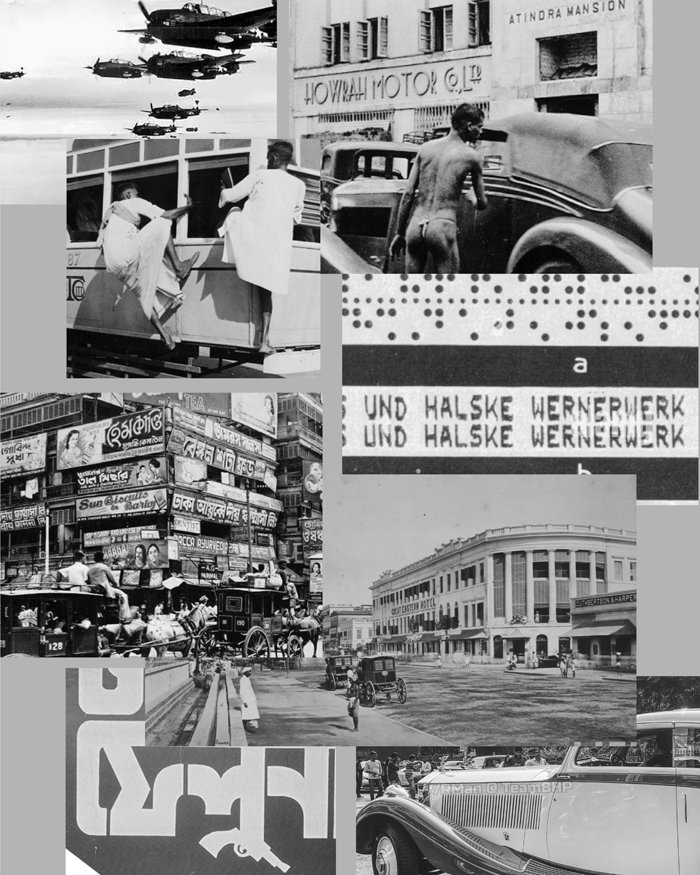
The designer says he looked at pictures of Calcutta from the 1940s, with the novel itself providing plenty of clues about the city, adding a dash of Bengali culture to the cover. “We were in touch with Ruchir Joshi all the time and took his advice at various stages of designing the cover.”

“I am myself a painter, photographer and filmmaker, and have a very strong visual sense of what I like and what I don’t like. I made sure that I didn’t interfere with Itu’s process at all because, as an artist, you don’t want external influence in your work. I was steeped in the book after working on it for two decades and wanted a completely fresh viewpoint for the cover as if it was not being made for me, but for people who might be interested in picking up the book,” says Ruchir Joshi, the author.
“We were intent on picking a very pop color scheme for the Great Eastern Hotel. When you write a novel about a city that is very serious, the novel can take on a great deal of weight as though you have something very important to say. It’s good, but I thought it would be a good idea to make it seem like it was also something fun, something different that you should look at and free it from that wazan of being a classic. It’s a signal that says you can read this – it’s a fat book, but it’s a juicy, interesting book. The color tells people it’s okay to read this book. You don’t have to be a big reader to read this book. You don’t have to be a person interested in literature to read this book. You don’t need qualifications or a license to read it. It’s for everybody. If you are just willing to listen to a story, nothing in this book will prevent you from reading it,” says Chaudhuri.
The author adds, “The Bong Deco typeface created by Itu is witty, inviting, fun, and at the same time it has gravitas. I like the whole maze concept and the Bong Deco lettering of the cover, but the fuchsia pink and mauve used in the color scheme of the cover are not my favorite colors. However, I understood that I wasn’t decorating the furniture in my living room, and when I thought about it as a book cover, it made complete sense to have this color scheme and this theme. It really popped out. The cover kind of grew on me, and I am glad it did because it’s a brilliant cover. It’s a really unique cover design, and it stands apart in bookstores.
“We have all heard about the popular idiom, Don’t judge a book by its cover, but in reality, we are always judging books by their covers. We pick up a book as we find a particular feature interesting or alluring. Book covers are very important as they draw you into the book. When you remember a book, you remember it for the story it told you and the ideas it gave you, but you also have an indelible visual memory of the book. If you are reading the Great Eastern Hotel and you close the book and open the book again, you can start seeing the different elements of the book that Itu has put on the cover, and a lot of them make sense to you only after you have read a significant portion of the book.”
About the significance of book covers in purchase decisions by readers, Chaudhuri says, “A bad book cover might cause sales to fail, but I don’t think that a very good book cover causes an increase in sales.” About the cover’s brief from the publisher Harper Collins, Chaudhuri says that he usually doesn’t work on book covers, except when he knows the author and trusts him enough to give him full freedom of expression with the cover, and he knows the author well enough to collaborate.
“We wanted to break away from the convention of a cover through this book, preferring weirdness over slickness, risking being awkward, maybe even ugly, and a touch mad. My own agenda, at least for literary works, is to make a cover that not only whets the appetite on the shelf, like packaging, but accompanies the reader as she reads the book, revealing its layers chapter by chapter.”
The cover is printed on cardstock with creased flaps using soft-touch and embossed effect coatings. It is well printed and bound by Thomson Press India in Faridabad. Itu Chaudhuri Design also designed the cover for the UK edition of the Great Eastern Hotel. “Conceptually, the designs for both the Indian and the UK editions are similar. Just the treatment of which kind of lettering to use is different. It’s just a different rendering of exactly the same idea,” he says.
Joshi notes that out of the five designs that Chaudhury submitted, another one is also being used for the UK market as Harper Collins (which is also the UK publisher) feels is better suited for the British market, and he, Chaudhuri, and the London team of Harper Collins worked together to come up with the final cover.
This article is from the upcoming October issue of Indian Printer & Publisher. It has been slightly modified by the editor on 19 September 2025 at 11:51 am.


