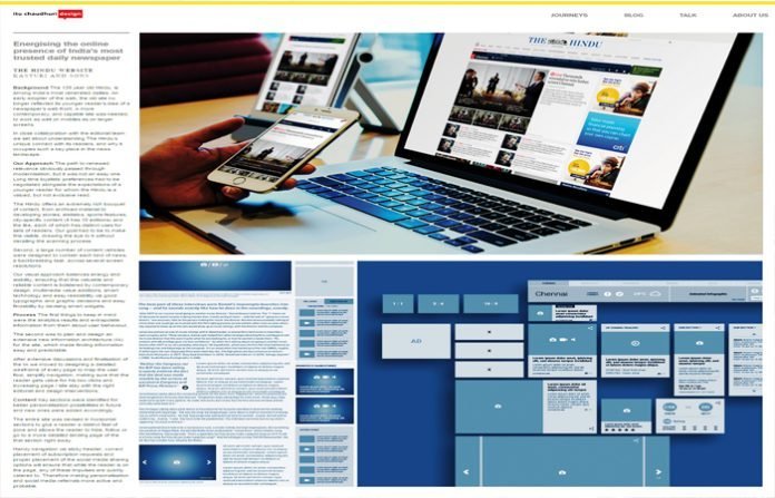
Excerpts from the excellent design blog on the website of Itu Chauduri Design which addresses the redesign of The Hindu website under five headings: Background; Our Approach; Process; Content; Home everywhere; Form follows content; Virtual Design; and, Typography.
Our Approach The path to renewed relevance obviously passed through modernisation, but it was not an easy one. Long time loyalists’ preferences had to be negotiated alongside the expectations of a younger reader for whom the Hindu is a valued, but not exclusive read.
The Hindu offers an extremely rich bouquet of content, from archived material to developing stories; statistics, sports features, city-specific content (it has 16 editions) and the like, each of which has distinct uses for sets of readers. Our goal had to be to make this visible, drawing the eye to it without derailing the scanning process.
Second, a large number of content vehicles were designed to contain each kind of news, a backbreaking task, across several screen resolutions.
Our visual approach balances energy and stability, ensuring that this valuable and reliable content is bolstered by contemporary design, multimedia value additions, smart technology and easy readability via good typographic and graphic decisions and easy findability by devising smart widgets.
Content Key sections were identified for better personalisation possibilities in future and new ones were added accordingly.
The entire site was devised in horizontal sections to give a reader a distinct feel of zone and allows the reader to hide, follow or go to a more detailed landing page of the that section right away.
Handy navigation via sticky header, correct placement of subscription requests and proper placement of the social media sharing options will ensure that while the reader is on the page, any of these impulses are quickly catered to. Therefore making personalisation and social media referrals more active and probable.
Form follows content To help The Hindu establish itself in the minds of new readers and old patrons as a creator of superior, diverse content, we devised a section called Hindu Specials. it will house four types of special content that the old site failed to highlight and display. Packages, Series were old specials, to which we proposed, and added Case Files and a Microsite.
These specials will allow a reader to choose a long-form topic being investigated and subjects of cultural importance to follow and get all news related to it in one place. It cements the reader’s loyalty to the site for its content, and the value the site puts on its information display.
As The Hindu is a paper of record for elections and data, microsites would attract readers, researchers and advertisers looking for current and accurate news in one place.
The same template should be used for big happenings across all categories like sports, entertainment, environmental and social issues.
Typography Two fonts were chosen to balance the Hindu personality with the need to cue change. Fira Sans and Modern Sans serif typeface was chosen to highlight current and happening news. Larger font sizes, bolder and the occasional use of colour are signals its new relevance for new Hindu readers.
This was juxtaposed with Tundra, a serif font, designed lately for great reading experience for the web and mobile devices. Its larger x-height and yet the humanist touch of old school serif fonts made it the right choice for this site.
All font decisions across the site were taken after testing and keeping in mind great readability on desktop and mobile both.
Given the constraint of designing within a 1000 px width the right choice of typeface was crucial to allow great throw and a smooth reading experience.


