


Interior design and décor are perfect candidates for large format digital printing, since the technology enables short print runs, down to single items, as well as short turnaround from conception to proof and final prints. But as with any type of print production, applied color management is key for a successful project.
One of the challenges when entering the arena of interior design is the wide range of substrates you may encounter. The same ink applied to a glass surface will not look the same when applied to fabric, or for that matter different types of paper. A classic way to assess how a certain ink, or named color such as spot colors will appear, is to ask for a print sample.
When we talk about paper, one well known manufacturer of spot color inks is Pantone, and you may probably be familiar with their color guides. What is little known is that Pantone also produces color guides for fashion, that is, print samples made on fabric and plastic. So one of the first steps to control colors in an interior design project is to get hold of print samples or color guides relevant for the substrate at hand.
Since some of those color guides are quite expensive, you might ask the printer to allow you have a look in the color books. Later on in the process you should be able to have samples, proofs, printed on the actual device which will be used in the final production, on the actual substrate you have chosen. This is one of the obvious benefits of working in a truly digital workflow: the possibility to print a single copy economically.
The more advanced options
Full color control in a print project means color accurate previews of the design early on in the process. But in order to be able to trust what you see on the computer screen, you need to make sure the monitor is good enough. Good enough for color accurate proofing demands a high-quality monitor and the ability to calibrate it properly. Unfortunately, there is no way around this: standard (read cheap) monitors are not up to this task. They might have a large enough colour gamut technically, but unless you can calibrate the monitor using a colorimeter or spectrophotometer, you have no control over how it displays the colors or knowing if they really are color accurate.
Another difference between high-end monitors for color proofing and standard monitors is the degree to which they are sensitive to view angles. On most standard monitors, the colors differ a lot even with a slight change of viewing angle, and this is not good enough for color accurate softproofing. The monitor needs to have the higher quality panels using IPS technology (In Plane Switching), which means they show colors in the same way regardless of what view angle is used. Watch out for this in the technical specification and make sure the monitor you plan to try out or buy uses IPS technology. Also make sure the monitor comes with a hood, to block out surrounding light, another factor which will affect how colors appear on screen. If the monitor doesn’t come with a hood, you can find reasonably priced alternatives that can be fitted to any monitor.
Now you are ready to view your design in a color accurate way already from the start, assuming you have access to an ICC profile describing the color characteristics of the substrate and ink combination you will use.
This should normally be provided by your print service provider, but you might need to ask for this. ICC profiles are created by the printer when they calibrate the printing device, and every ICC profile is unique for a certain combination of printing device, printer settings, ink used and the substrate printed. By applying the right ICC profile in your design software, for example the Adobe CC, you can view the design as it will appear in print.
In Adobe Photoshop, for example, you will find this function under the View menu and then in the Proof setup submenu, where you can point to the ICC profile relevant for the printer and substrate you will use. As of today this only works well in Adobe CC for standard CMYK process colors. If you want to preview spot colors truly color accurately, you will need to invest in special software. The spot colors shown in Adobe CC match reasonably well, but only for spot colors printed either on glossy or matte papers. There is development underway to expand the ICC technology to better handle spot color in terms of color management and softproofing, but for now only some specialized software vendors offer solutions for a more advanced color management of spot colors than Adobe CC. Ask your printer how they manage spot colors, and what software they recommend for accurate softproofing.
All devices and substrates can be color managed
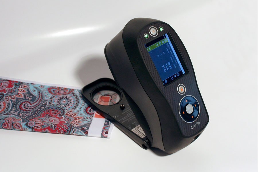
Since large format digital printing in general, and definitely interior design in particular, deals with many types of substrates like wood, glass, metal, plastic, ceramic tiles and so on, color management can be challenging. But basically all types of substrates and inks can be characterized using the right type of measuring device and relevant software. This job is of course not yours, as a designer, but a task for the printing company. We won’t go into too much details here, but we touch on it because unfortunately there are printing companies that claim that this or that material can’t be colour managed, and so blame colour differences on this. What they should add to such statements is “to our knowledge”. Be aware of this, and don’t take this to mean it can’t be done. Check with some other printer if they might have figured out a way to characterize the combination of printer, ink and substrate you are interested in using for your production.
For example, textiles might need spectrophotometers with a larger aperture than what is commonly used for prints on paper. For transparent substrates you will need a spectrophotometer which can make transmissive measurements. For substrates like metal you may need a spectrophotometer using what is called sphere technology.
If they still claim that they can’t create ICC profiles for the substrate you want to use, ask them to explain why. If their answer doesn’t make complete sense, it might indicate a lack of understanding of the more advanced color management technologies available. Unfortunately, this situation is not that uncommon in the printing community. Again, check with some other printers if they can color manage this type of printing scenario. Chances are you will find some who actually can do the job you want.


